A natural luxury in a social setting
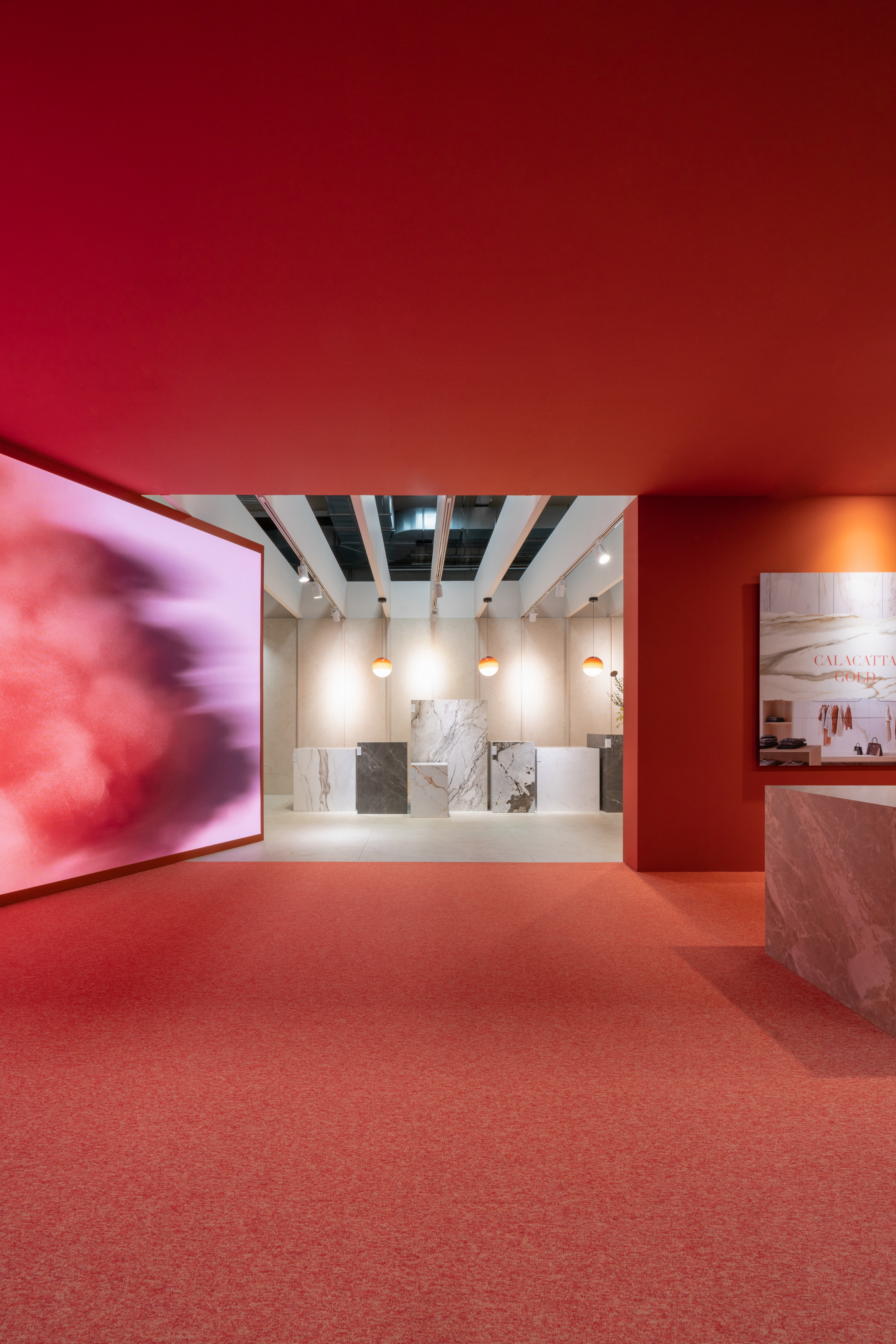
Estudi{H}ac, the interior design firm headed by José Manuel Ferrero, signed this ephemeral architecture project for VENUX under the title: ‘VENUX, a natural luxury in a social setting’. The project conveys a contemporary space, with great visual impact that brings luxury to everyday and social spaces. We analyse the project in detail in this insight.
REMEMBERING THE ICONIC MIES VAN DER ROHE
The project, as reflected in the design and architecture magazine ROOM, reflects, closely followed the elegant minimalism that always characterised Mies van der Rohe’s work and invited you to recall the iconic Barcelona Pavilion that Mies van der Rohe and Lilly Reich erected in 1929.
Seen as a whole, the space reflected the strong message of VENUX, where the elements of nature are intertwined with luxury, quality, design, craftsmanship, sustainability and high value. And all this, built under three concepts: nature, luxury and social.
THE BASICS OF ACCESSIBLE LUXURY BY VENUX
The foundations of accessible luxury that lie in craftsmanship and the high value of innovation, as well as the presentation elements of the Première collection, are taken care of down to the smallest detail to offer the visitor an unforgettable brand experience.
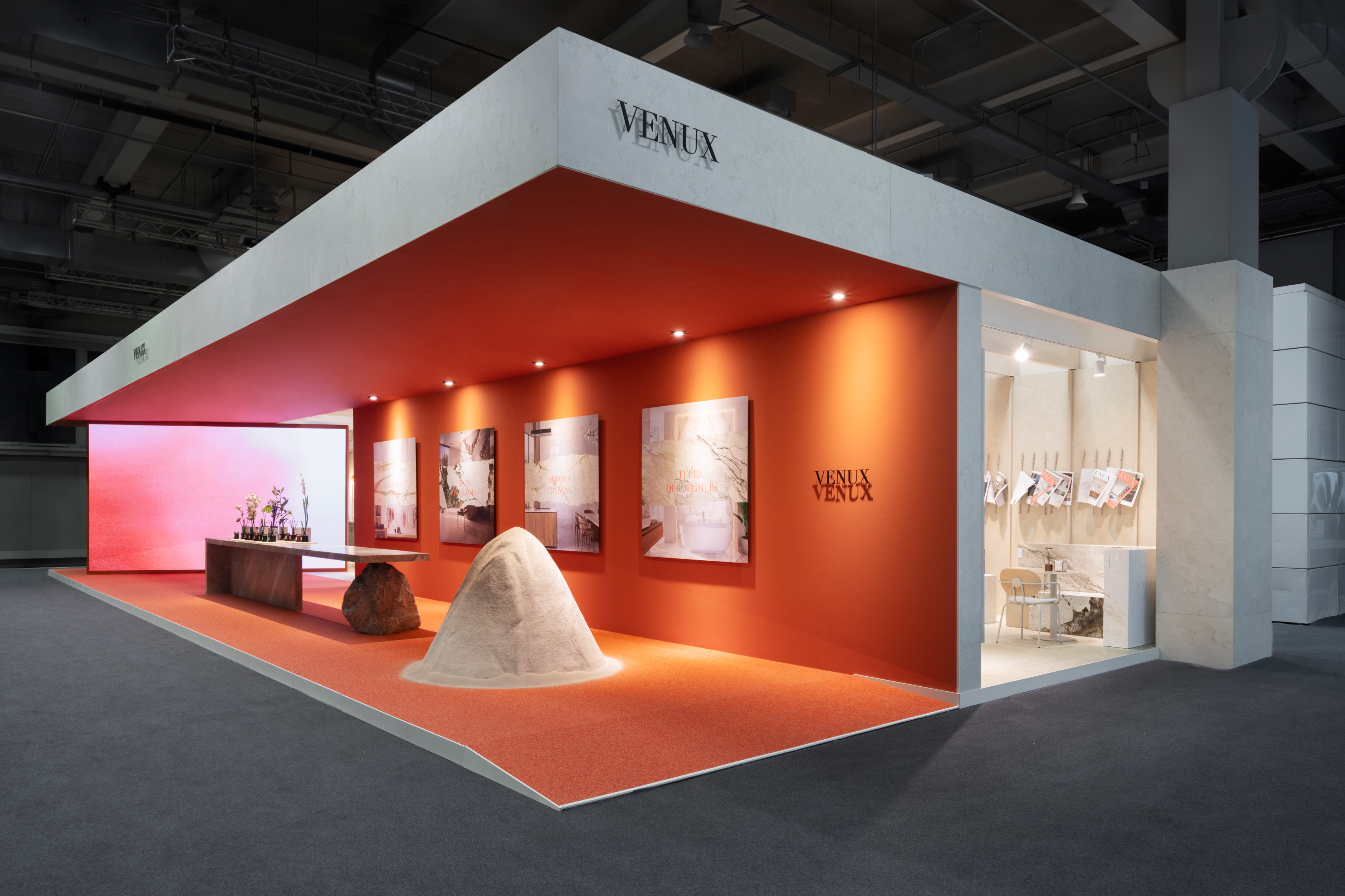
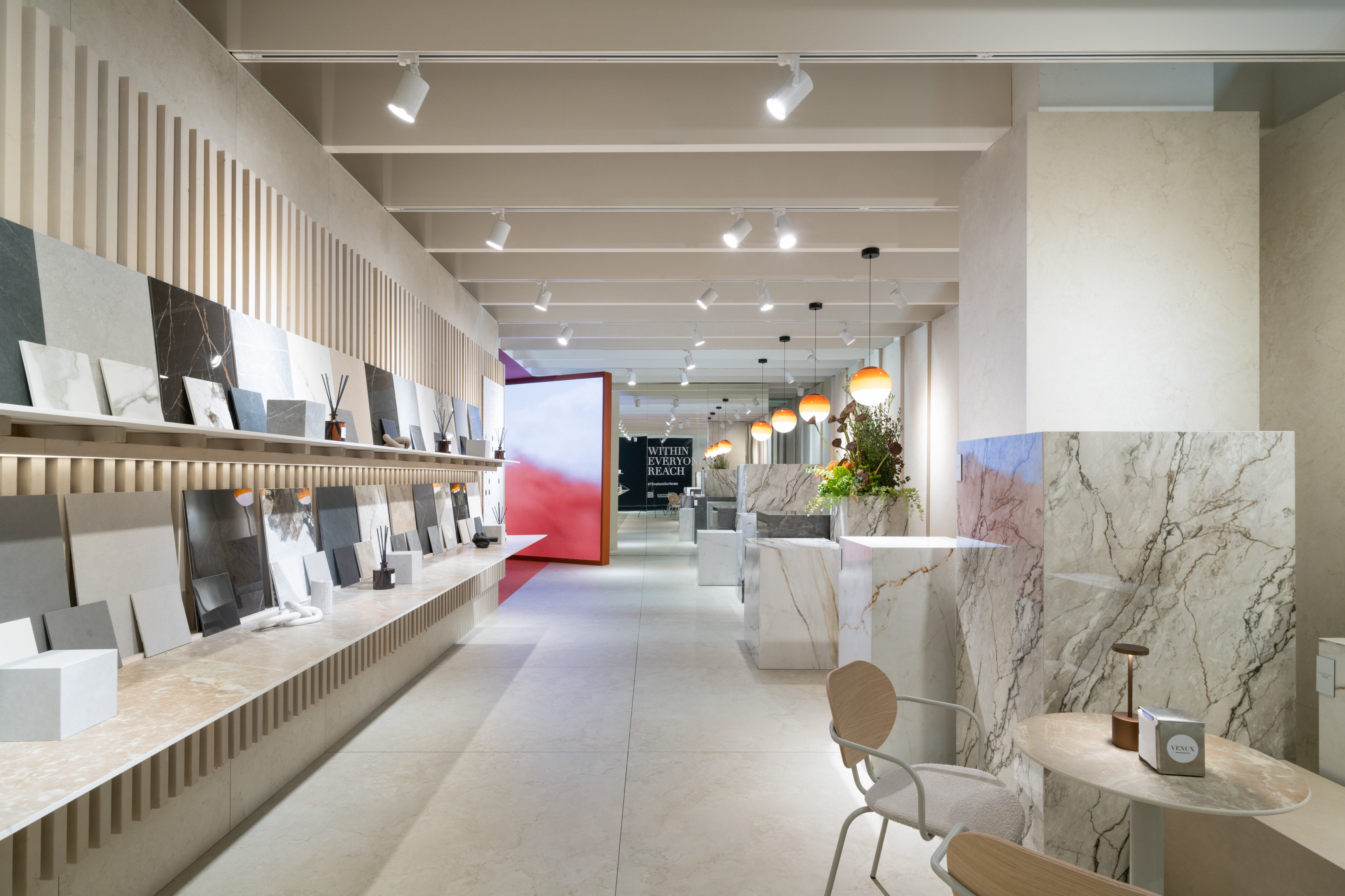
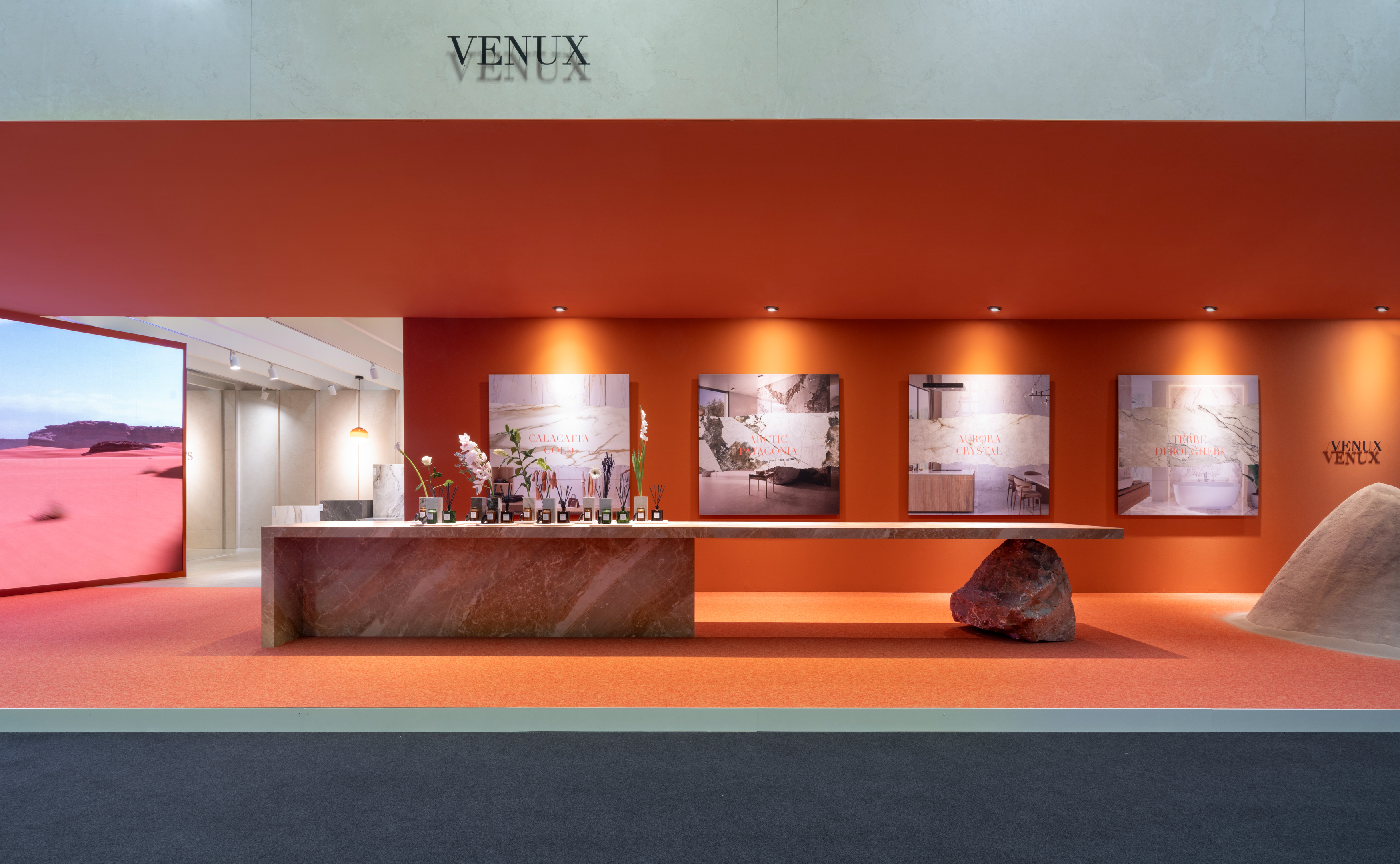
The design, the music, the scent, the lighting, the gastronomy… everything represented the brand image in harmony, in the two spaces into which the project was divided: the reception area that showed the brand and its values and the social area, where visitors could share and work with the collection, in a relaxed atmosphere.
Referring again to the wonderful article by ROOM, Estudi{H}ac and VENUX have been the bricks that have managed to make luxury accessible, combining technique and poetry in a continuous balance in the same environment.
The challenge was to achieve precisely that balance between exclusivity and accessibility, focusing on emotional value, status and a carefully crafted visitor experience.
CONNECTION: A COMPLETE SENSORY EXPERIENCE
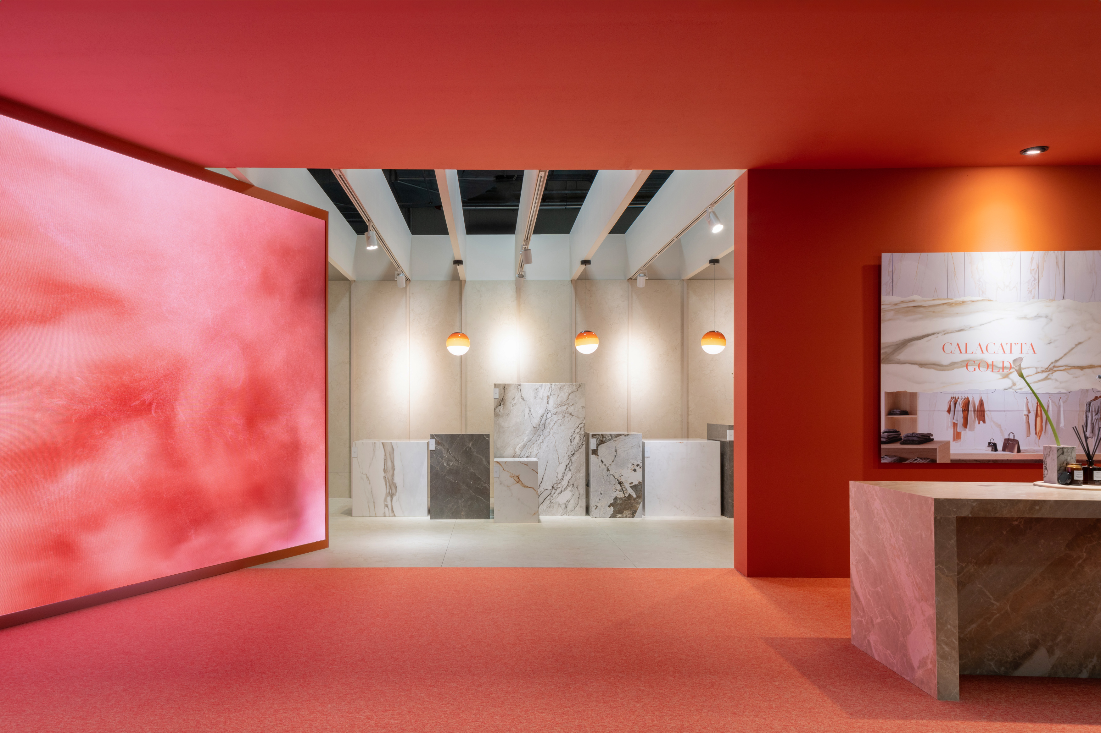
The first area, designed for connection, showcased the brand’s values based on nature transformed by technology, premium raw materials and the craftsmanship of our craft, which pampers the details to the utmost.
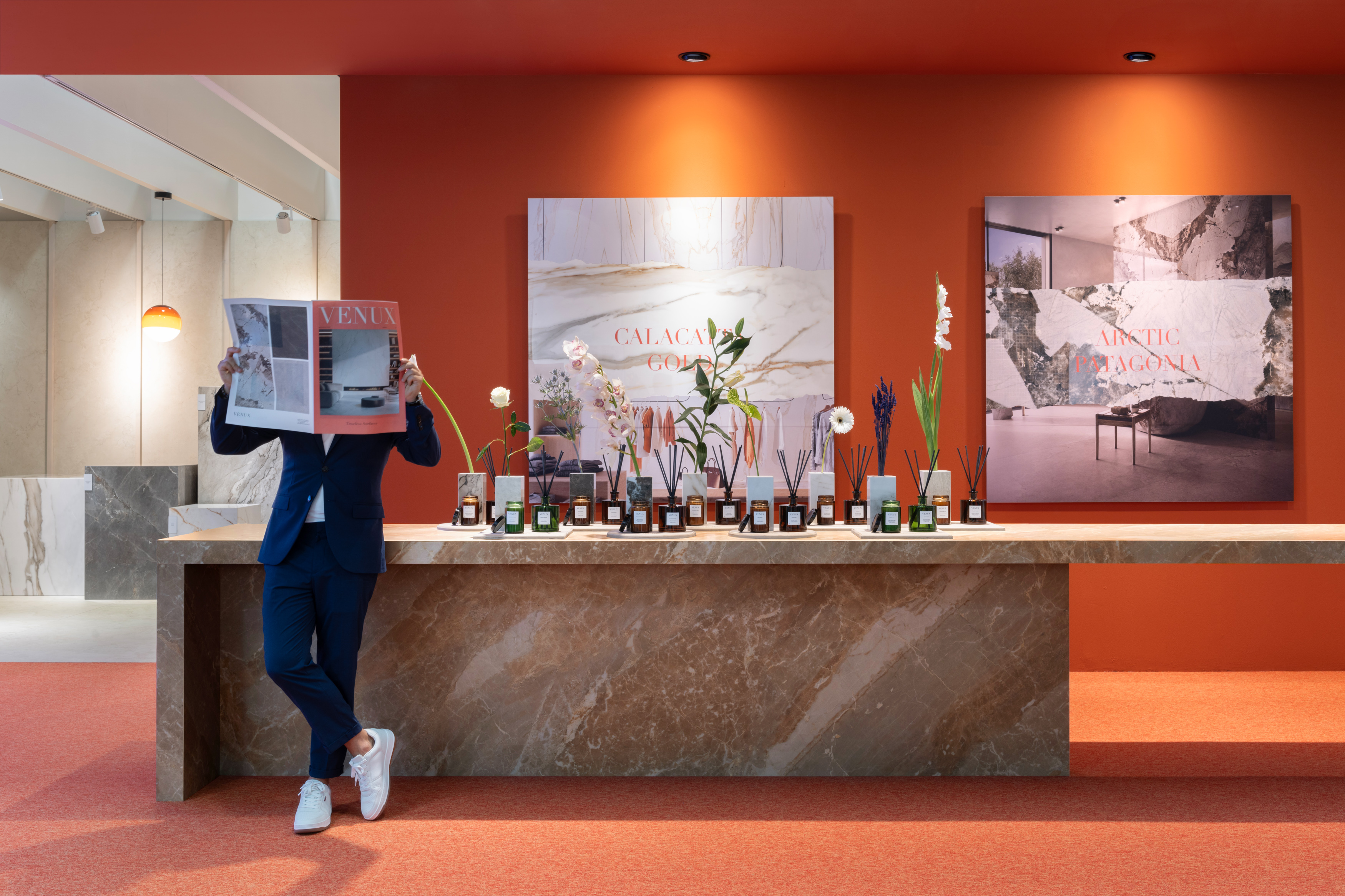
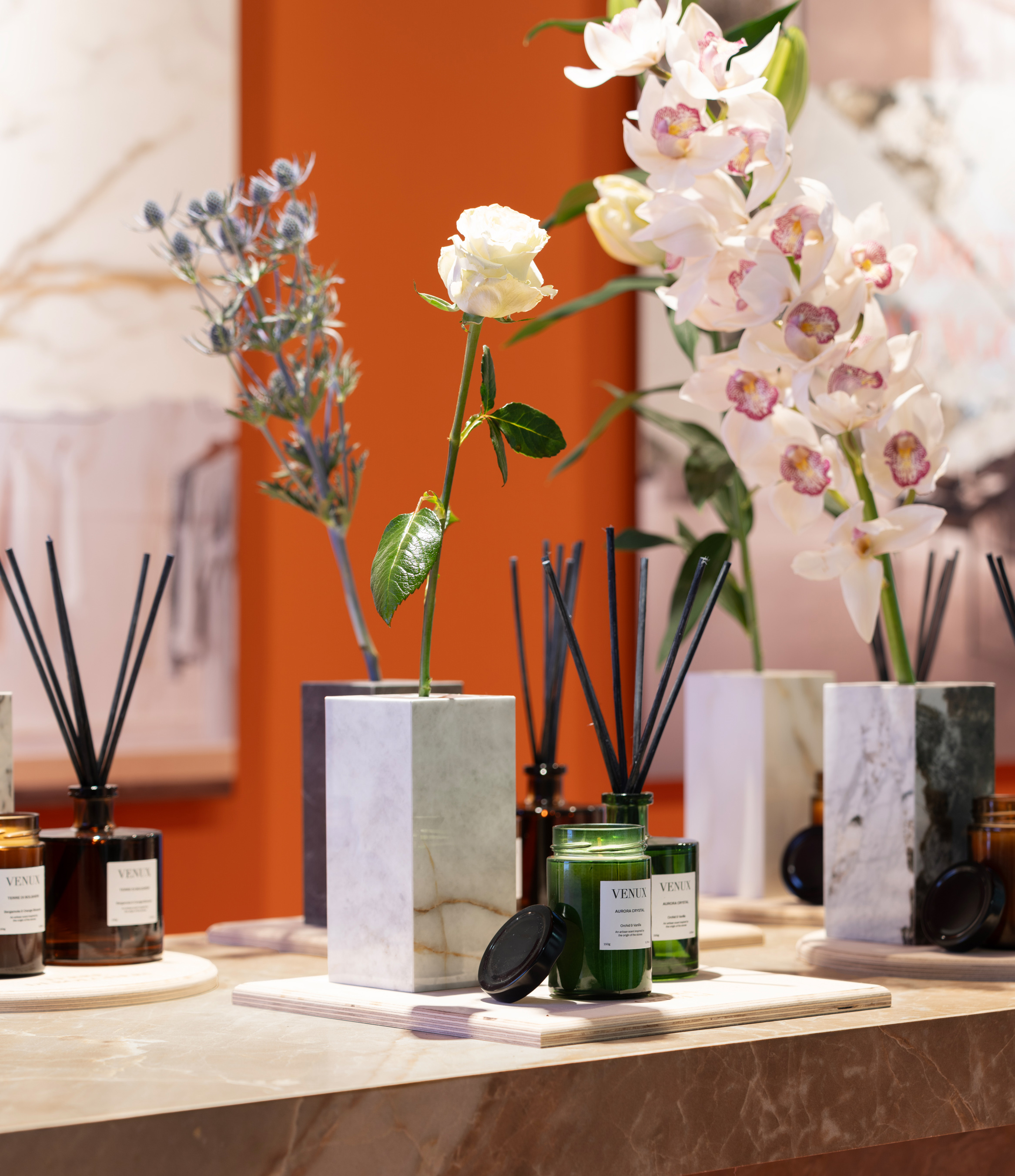
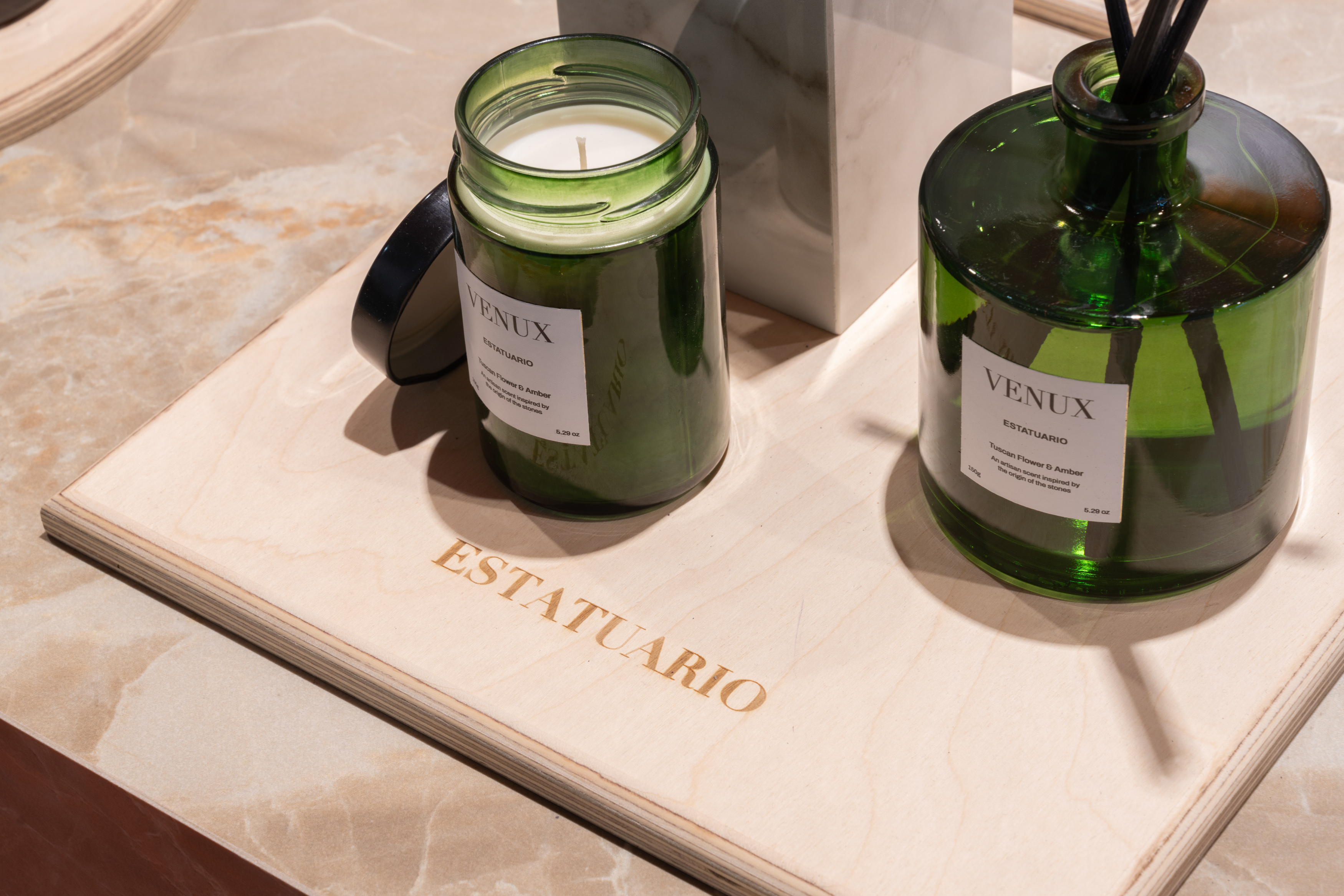
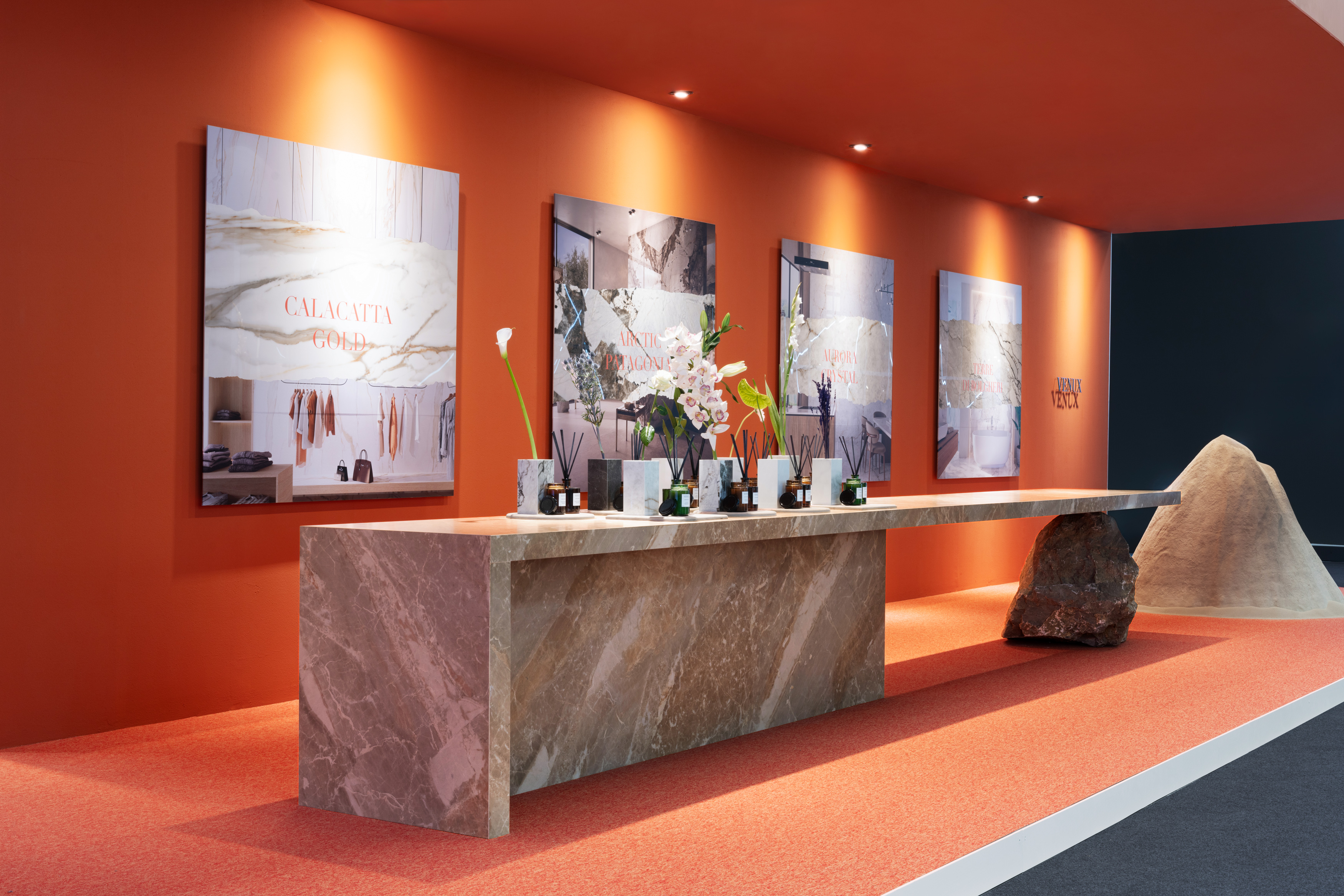
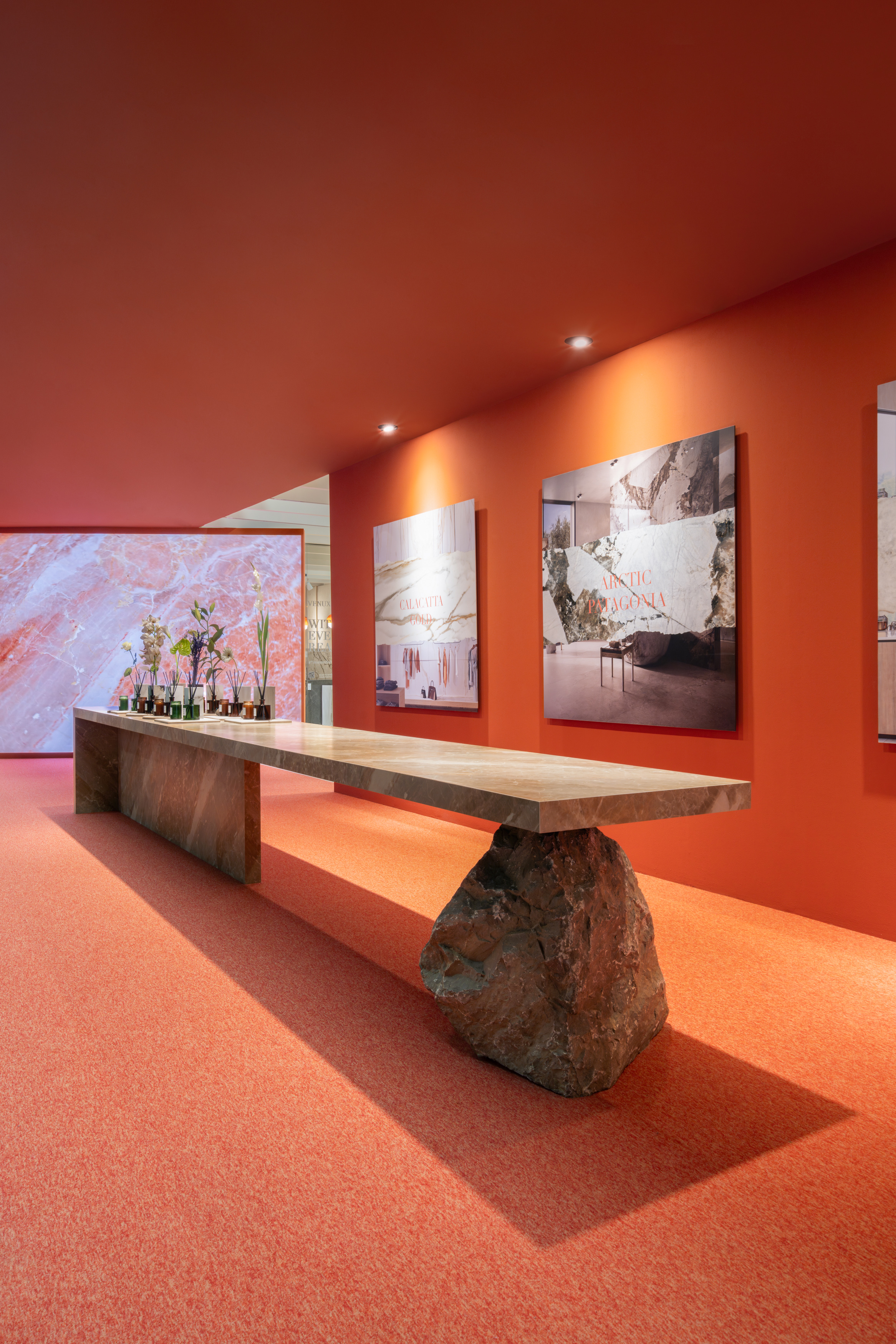
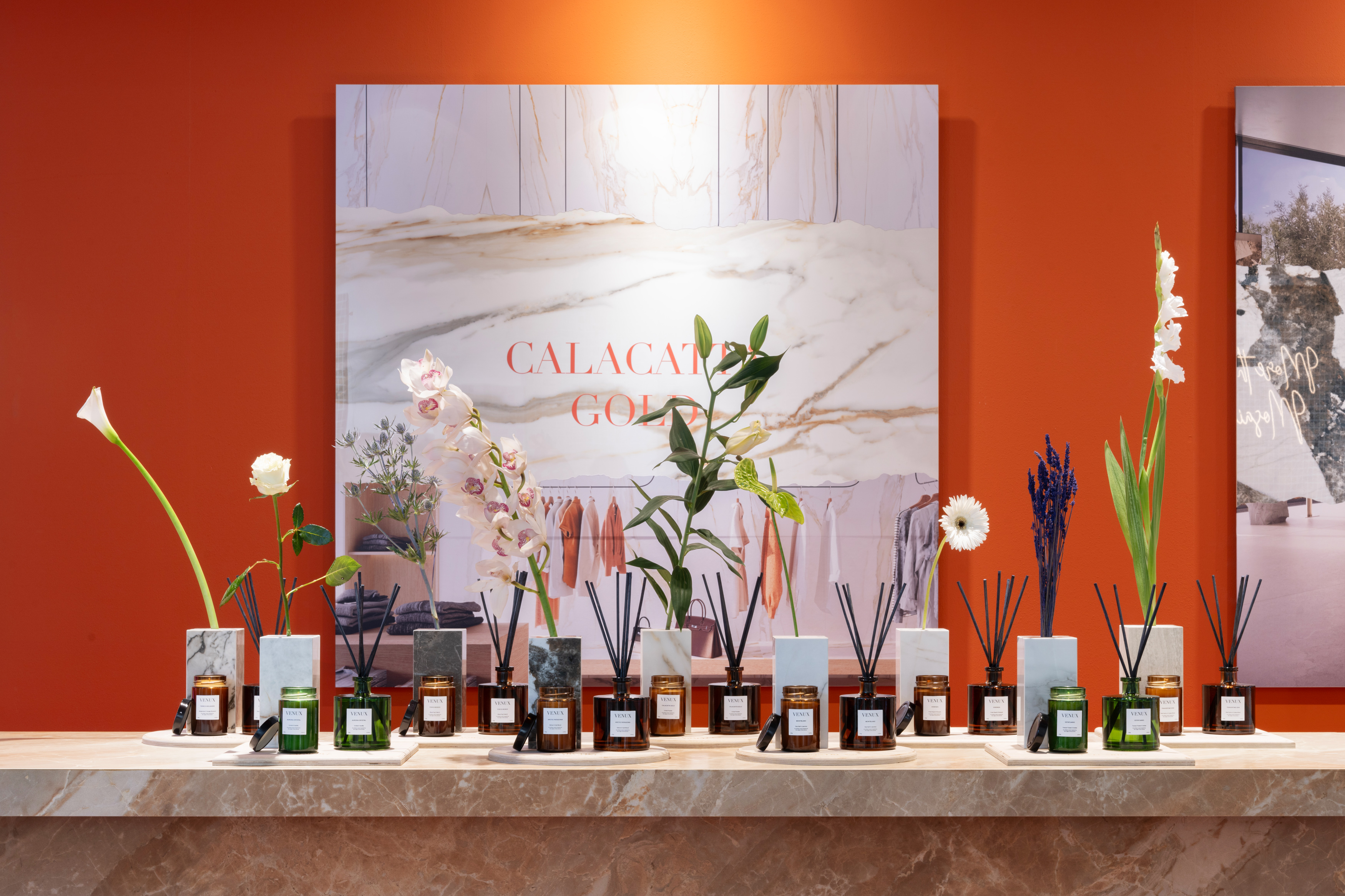
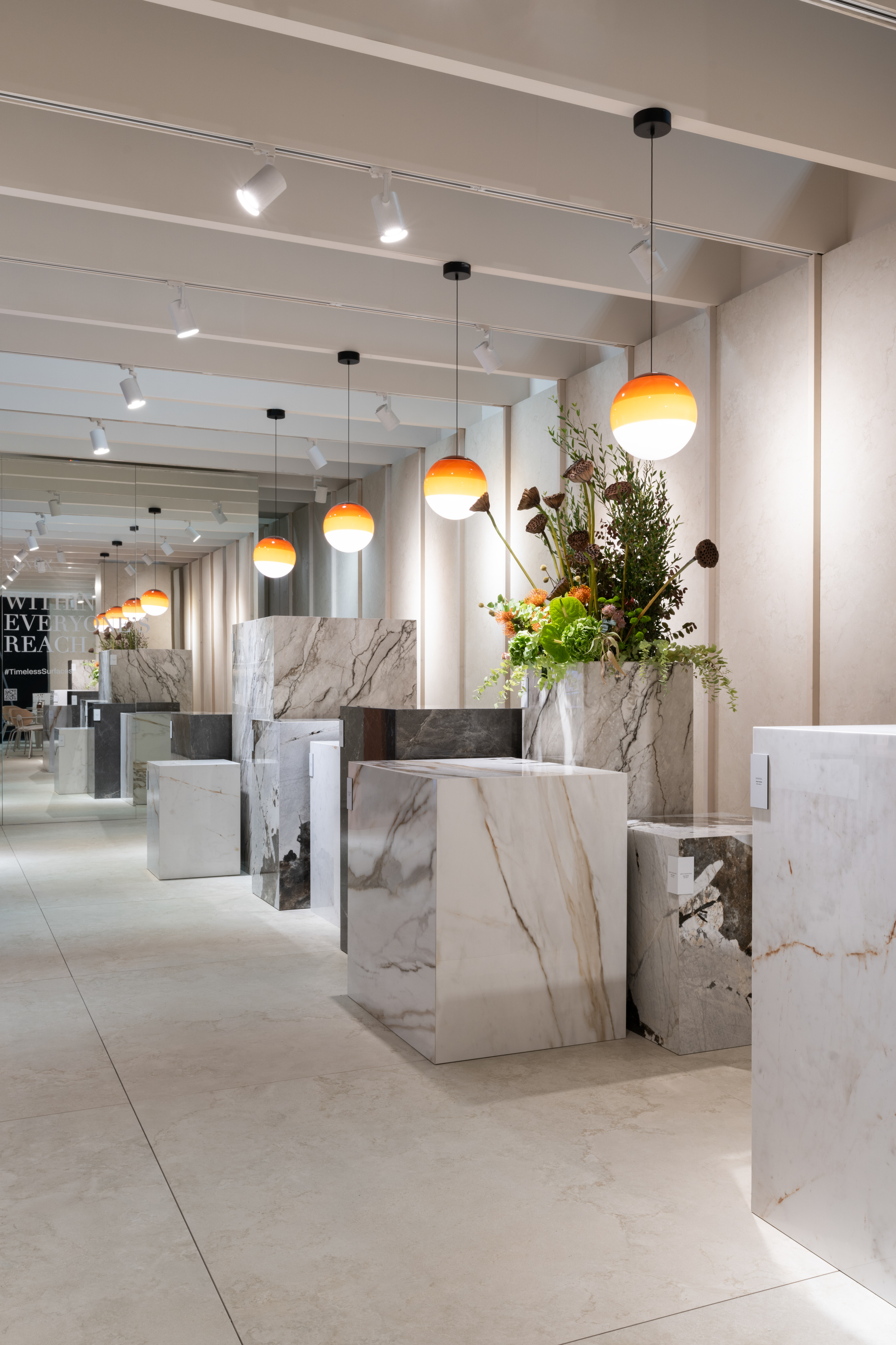
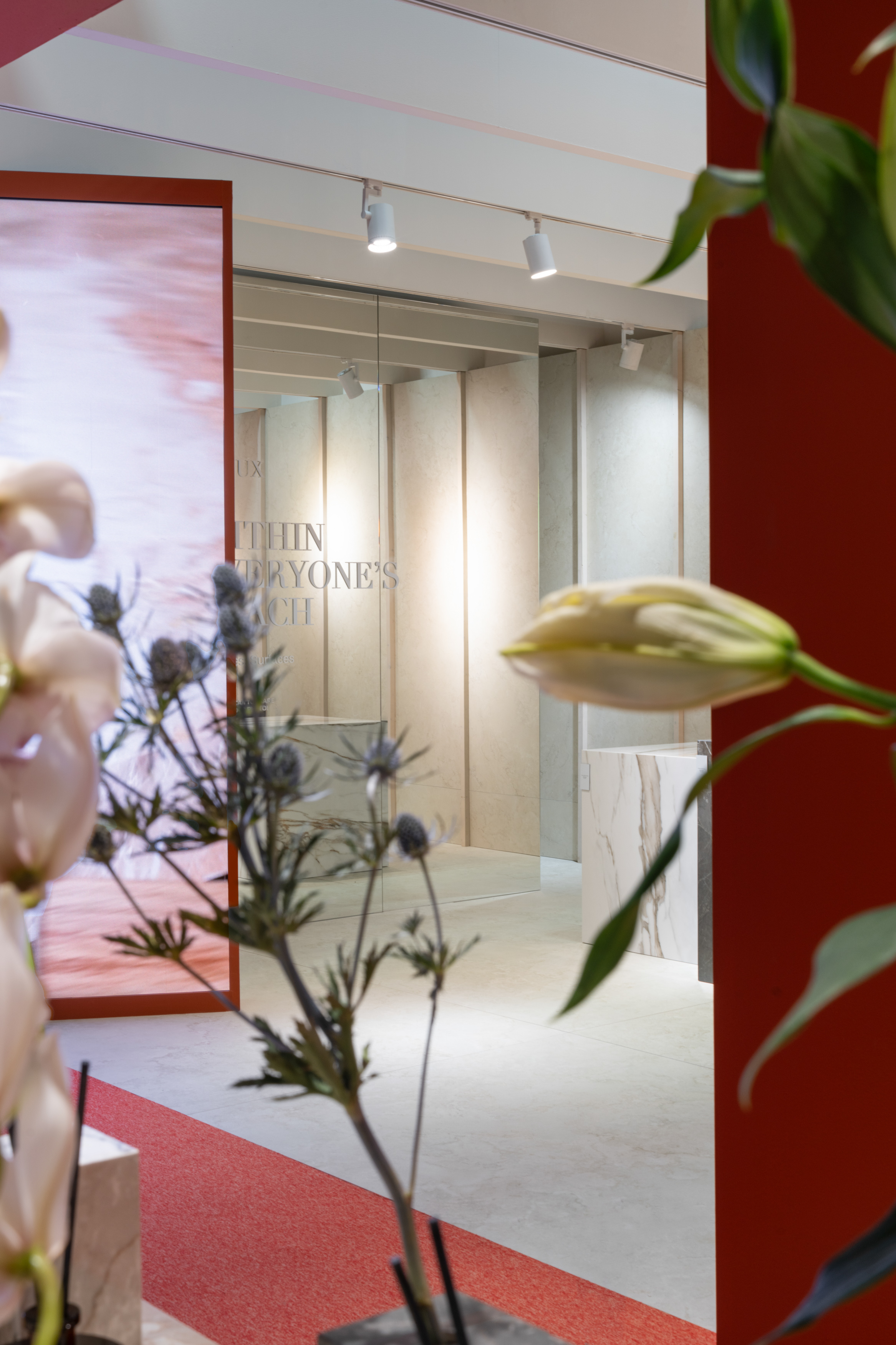
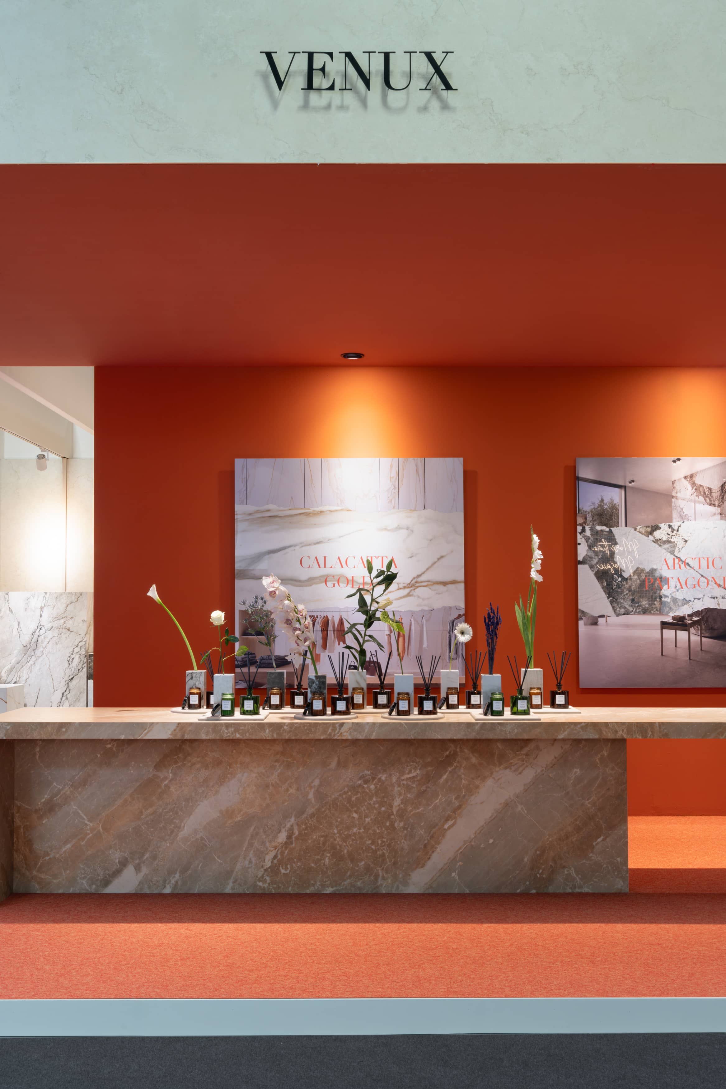
A complete sensory experience was offered, inspired by a garden of carefully selected flowers and scented candles that complemented and enhanced the natural beauty of each sintered stone presented in the vases, as containers of the essence of nature.
Each candle was designed to evoke a specific flower that inspired each collection, creating a play of scents that subtly blended with the environment.
In this space, guests arrived and were immediately captivated by the interplay of the floral scents and the visual elegance of the stones, offering a distinct experience related to the brand’s values.
Each sintered stone with its durability and beauty complemented the delicate scents of the candles and flowers in a welcoming atmosphere of calm and perfect harmony, enlivened by the brand’s music.
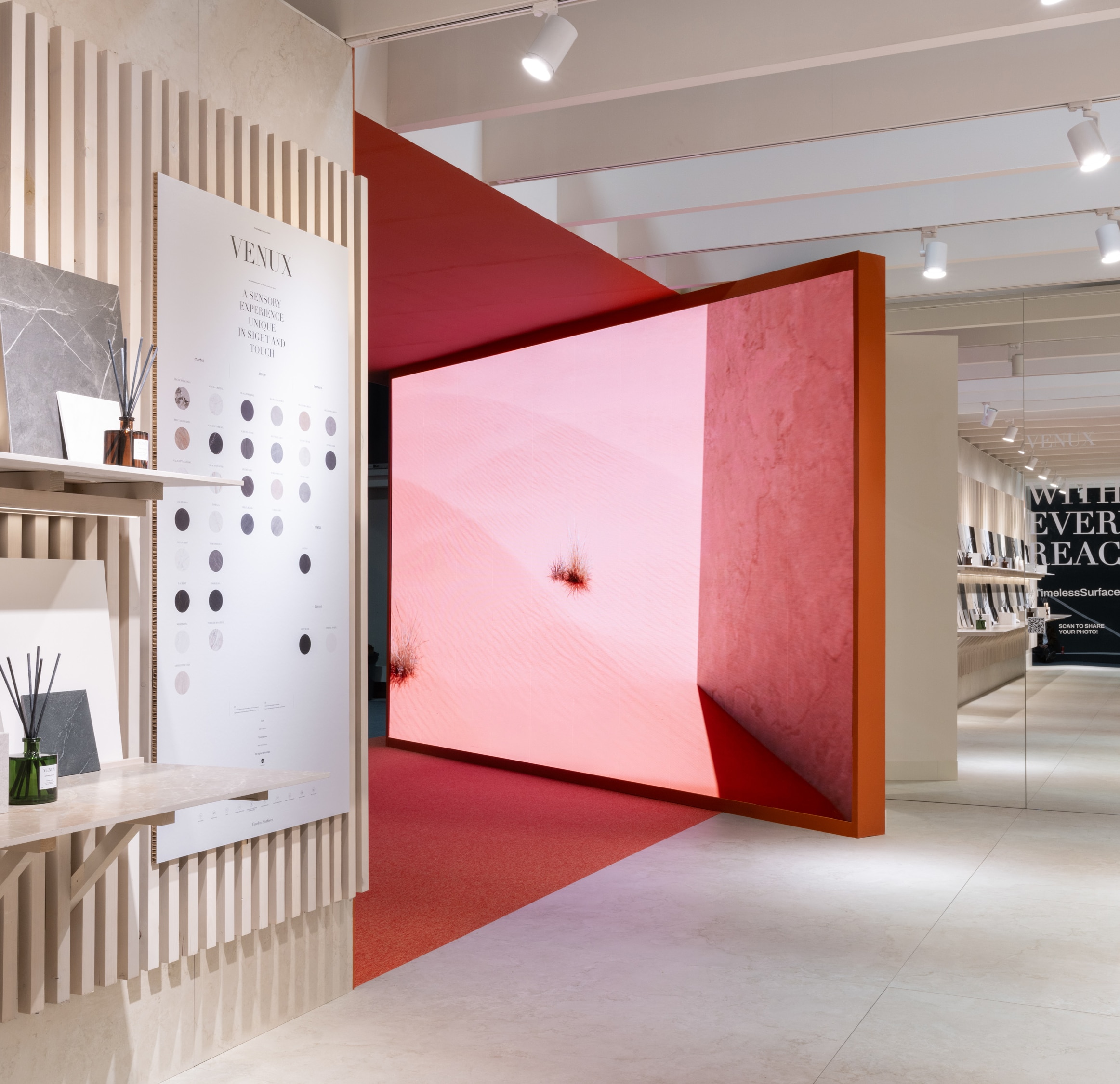
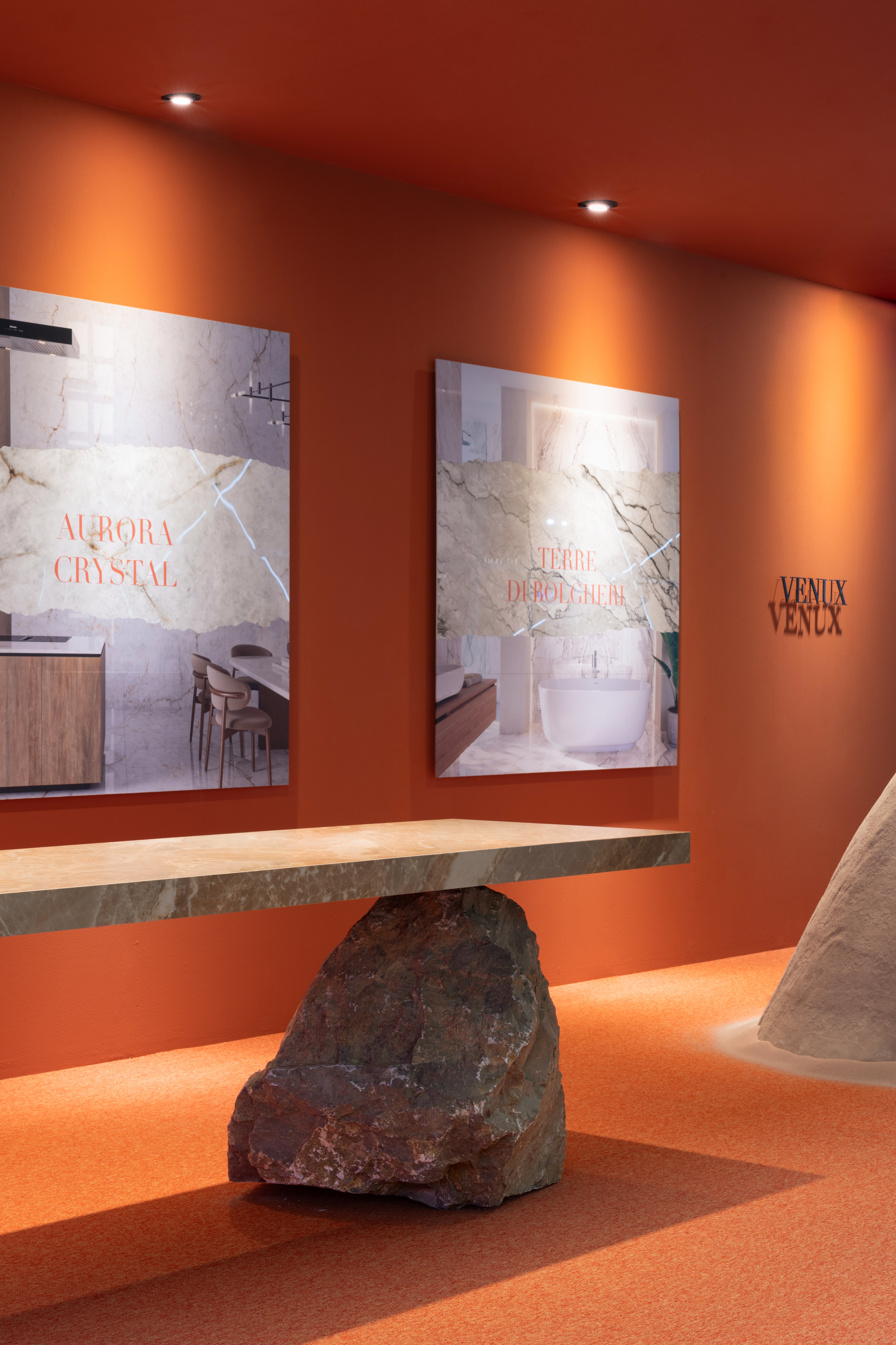
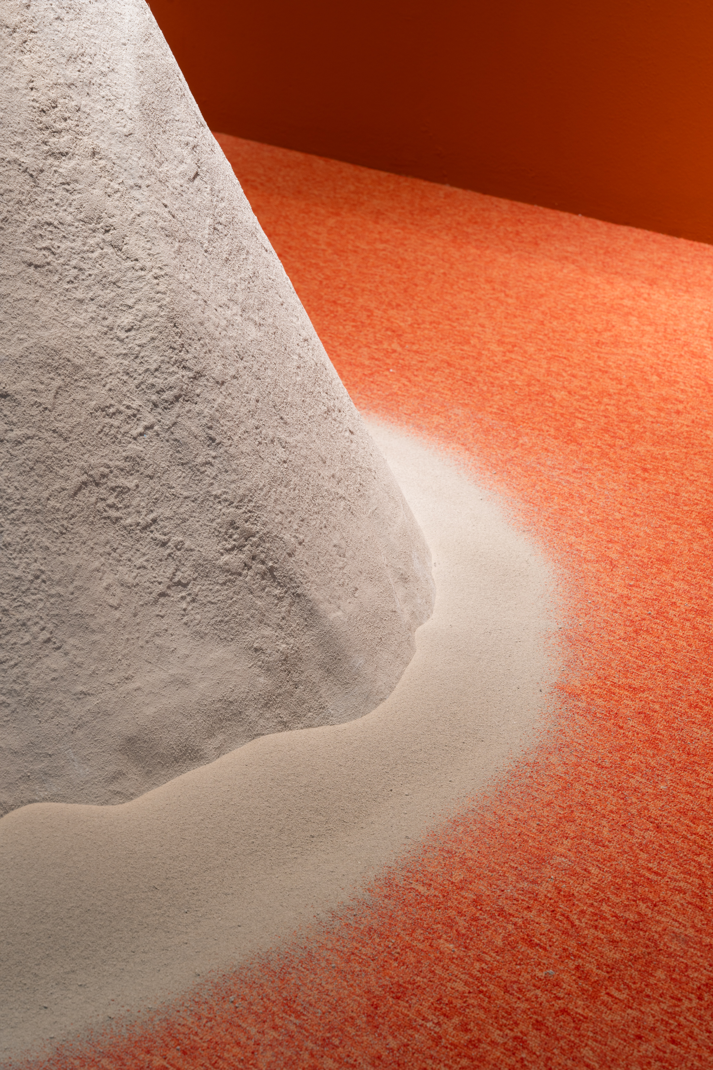
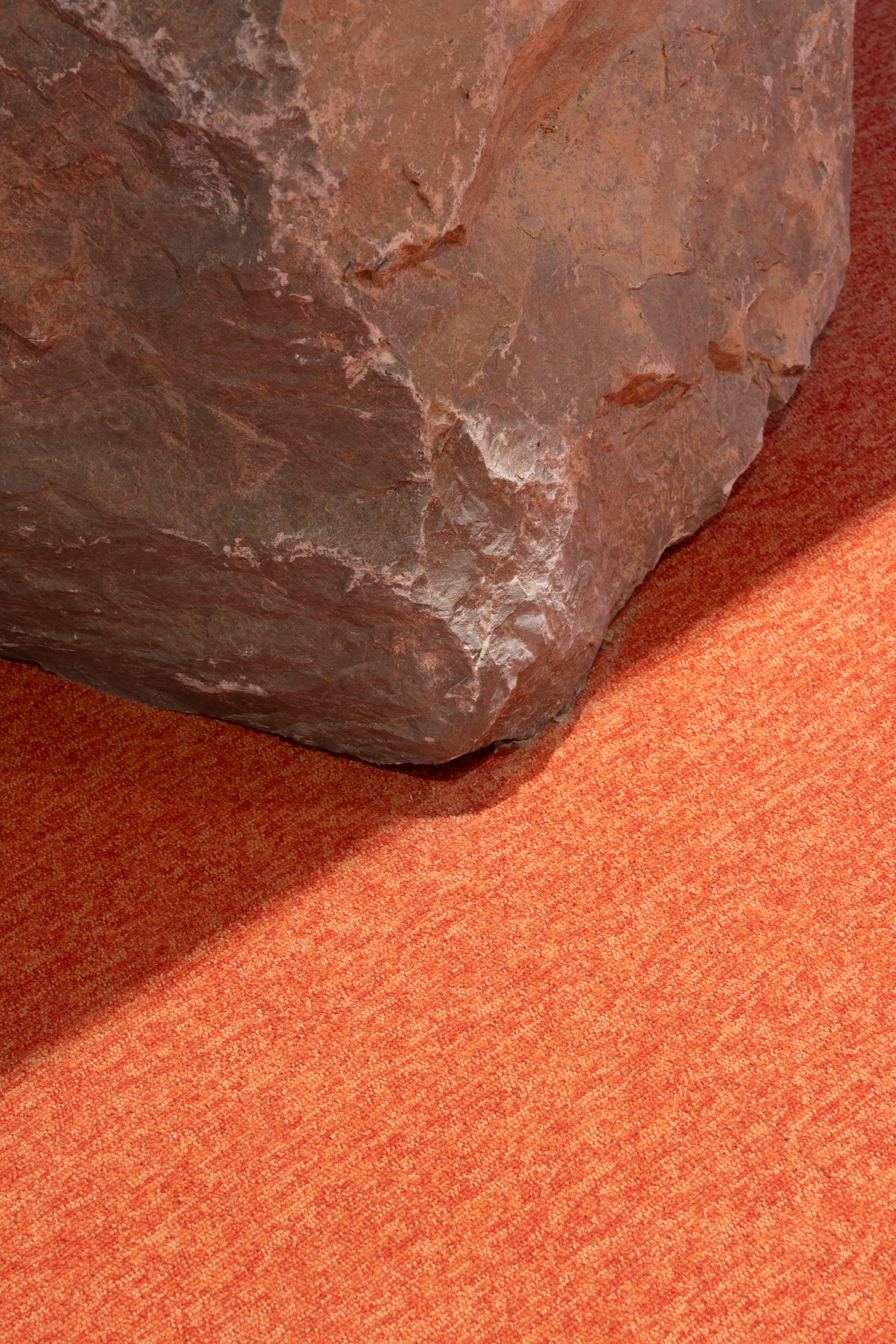
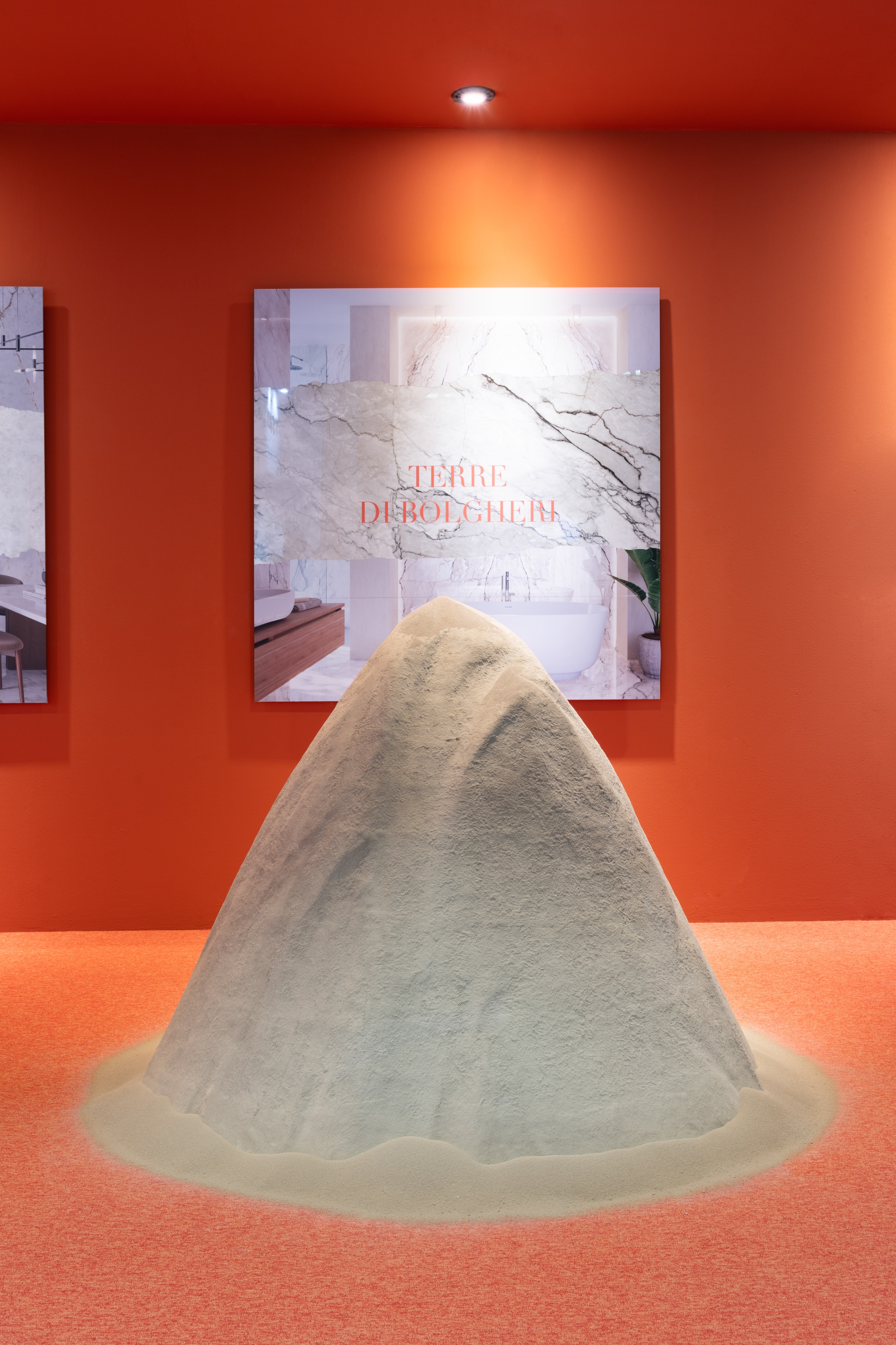
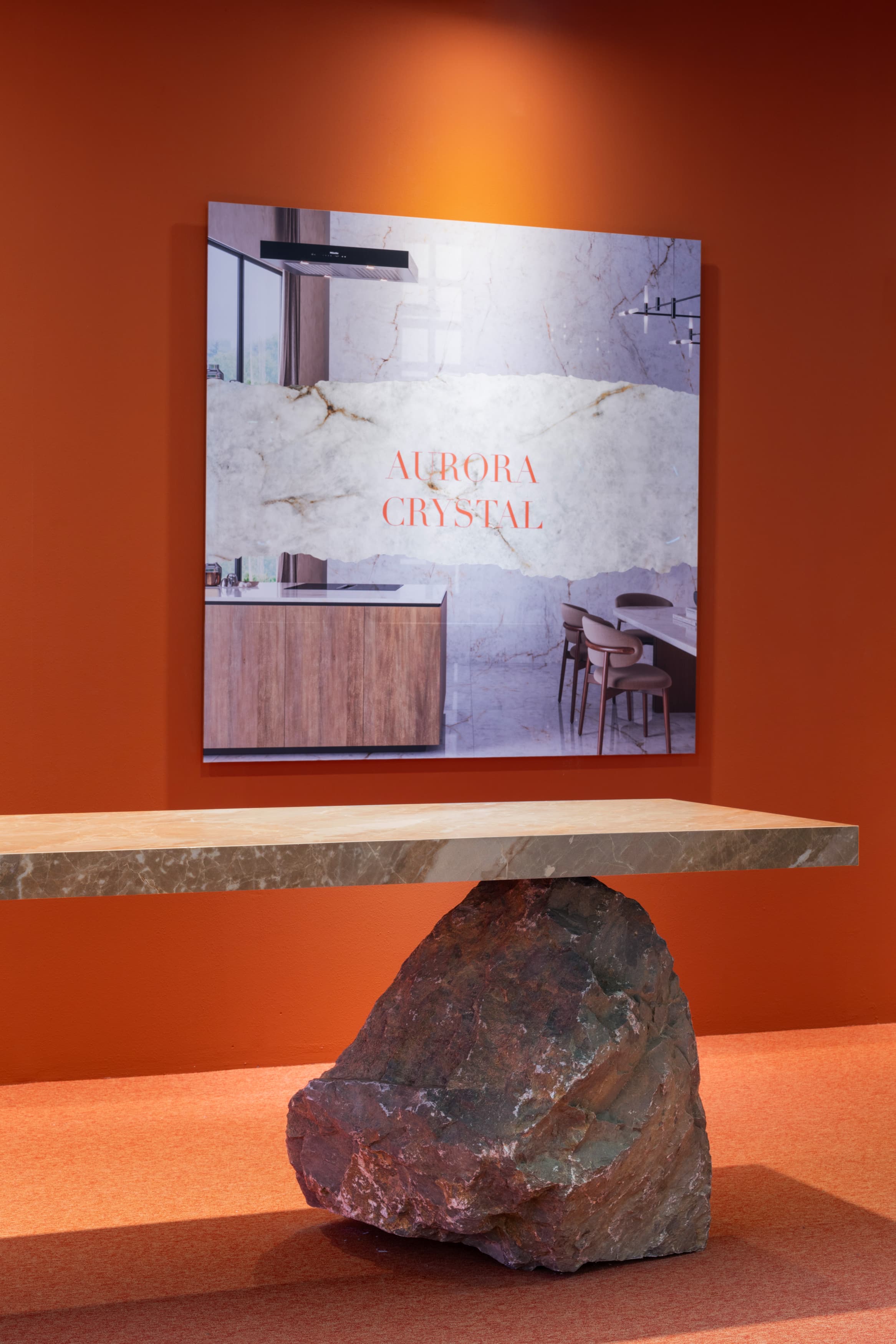
This space also displayed the raw material in the form of atomised earth and the worktop rested on a natural stone, the inspiration for the Première collection. Finally, an inspirational video showed the essence of our creation process.
From nature and materials to the value proposition.
CREATORS' CORNER
In the second area of the architectural project, visitors could find the creators’ corner, a meeting point for builders, architects, designers, distributors and creatives, designed to inspire and encourage collaboration.
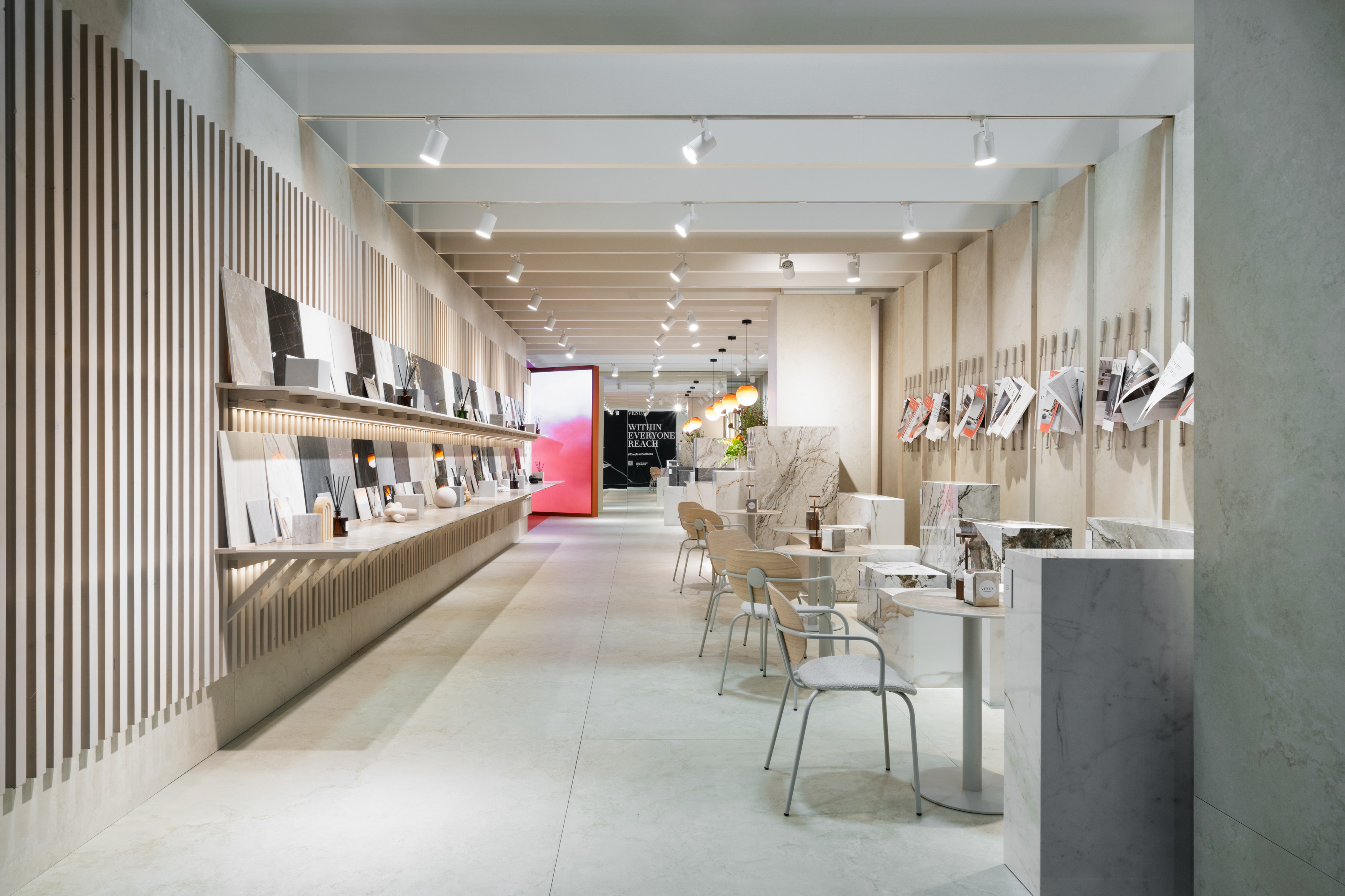
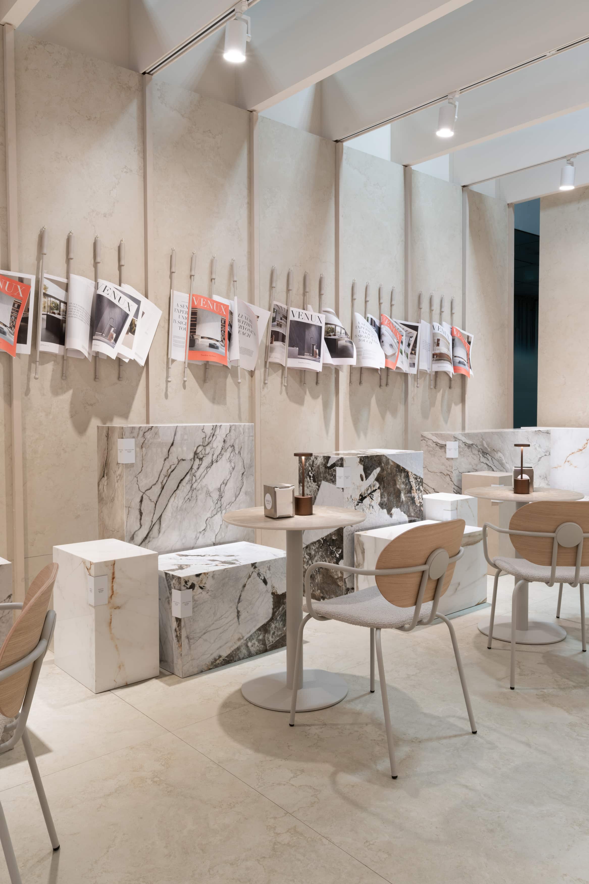
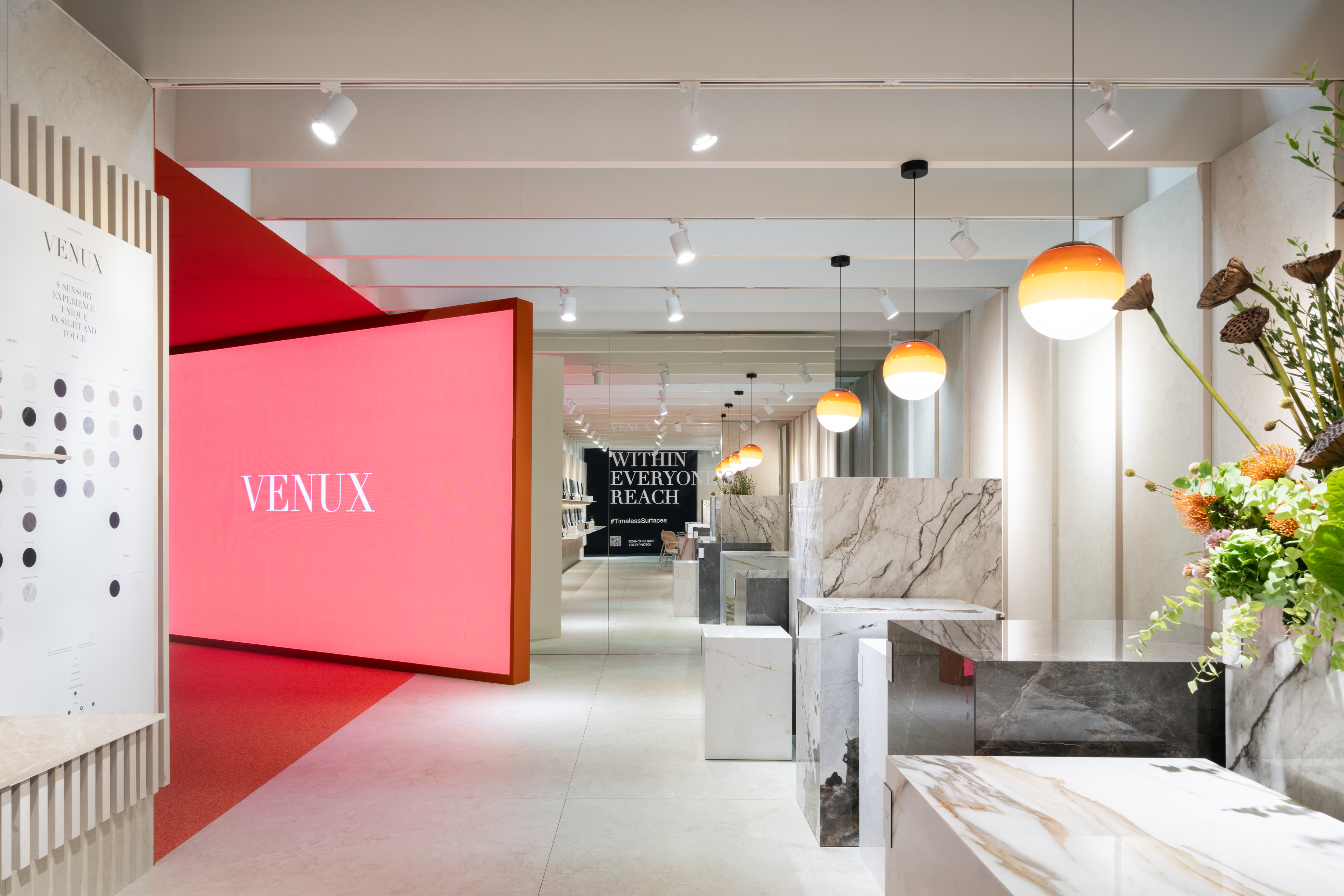
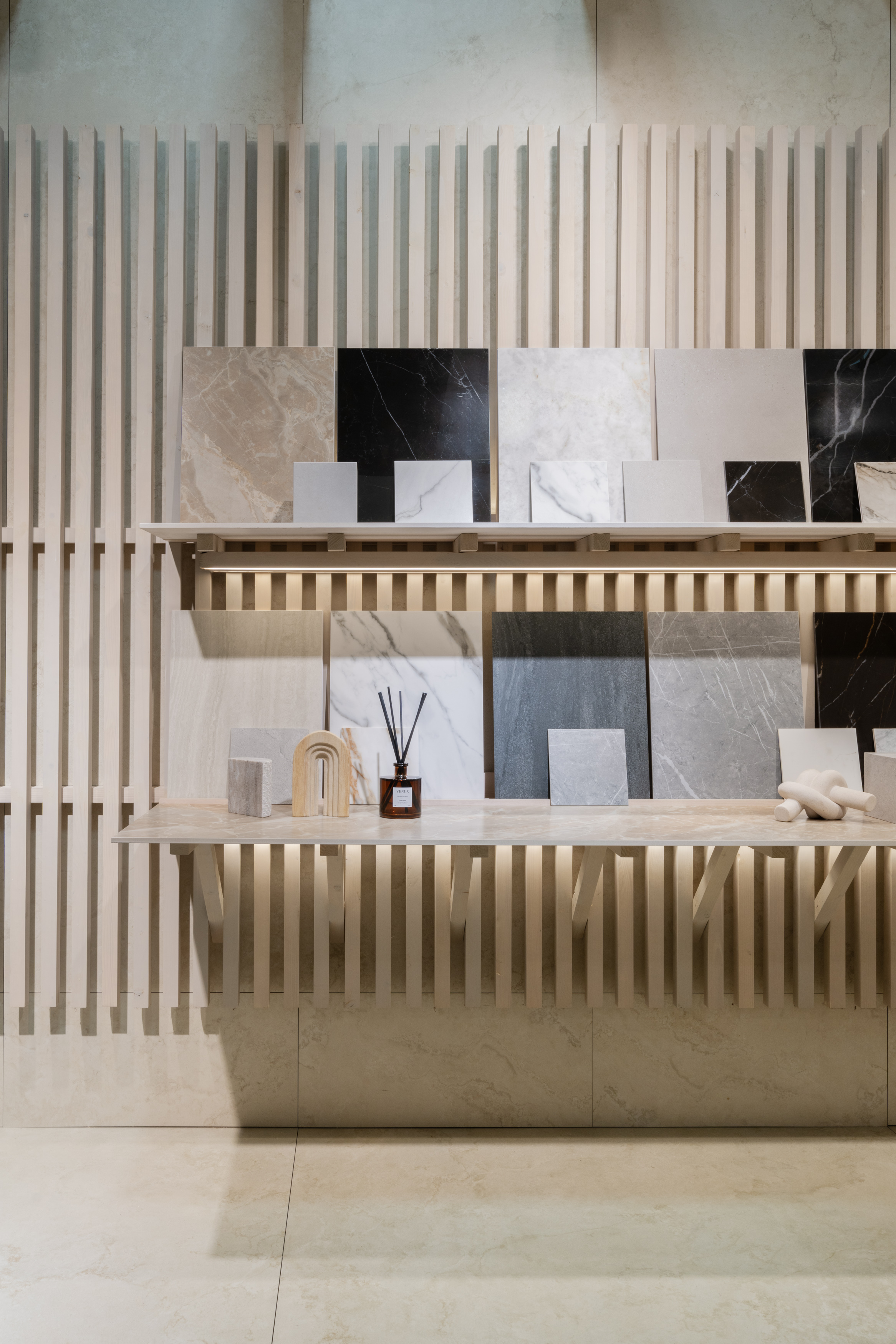
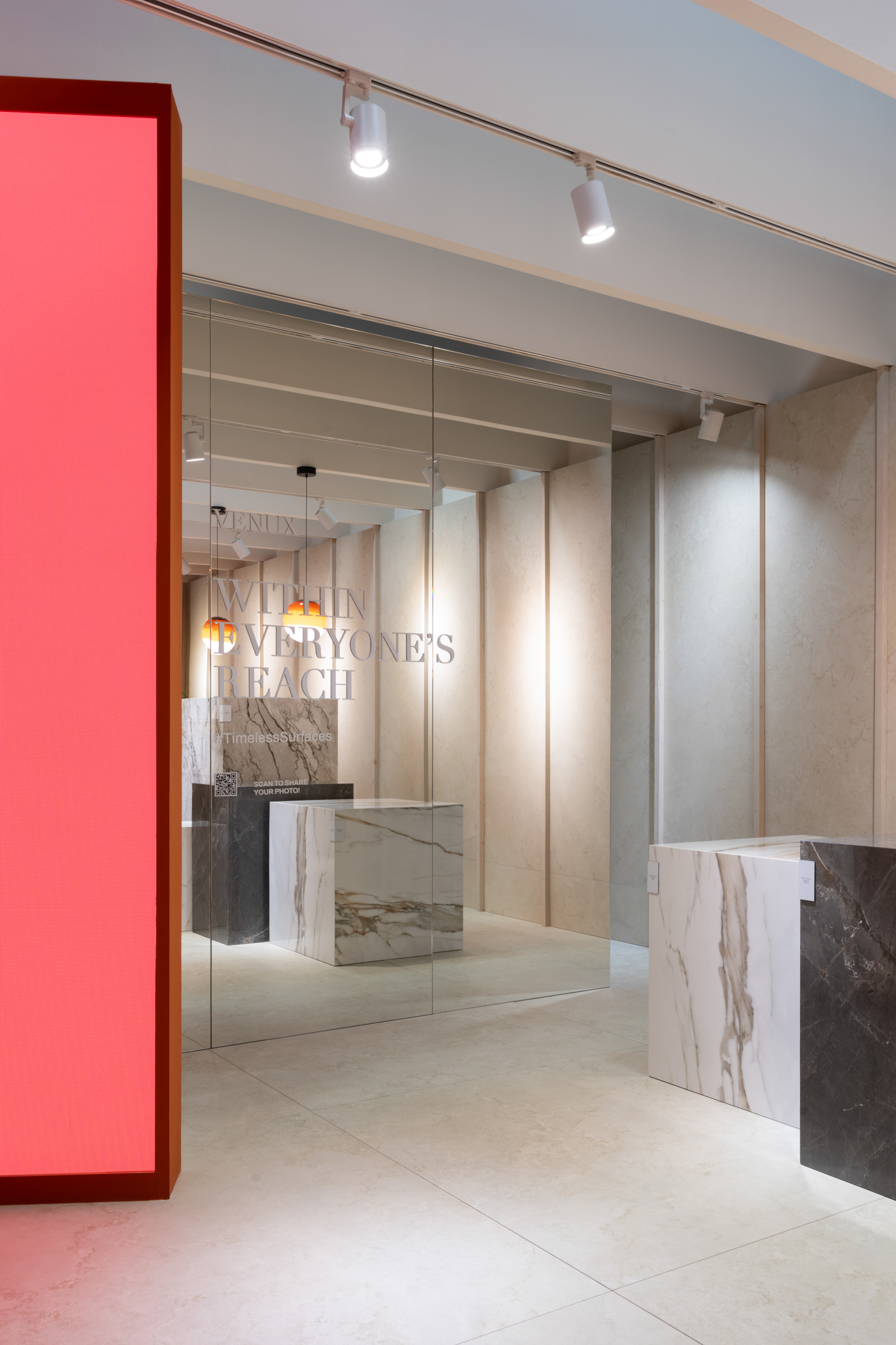
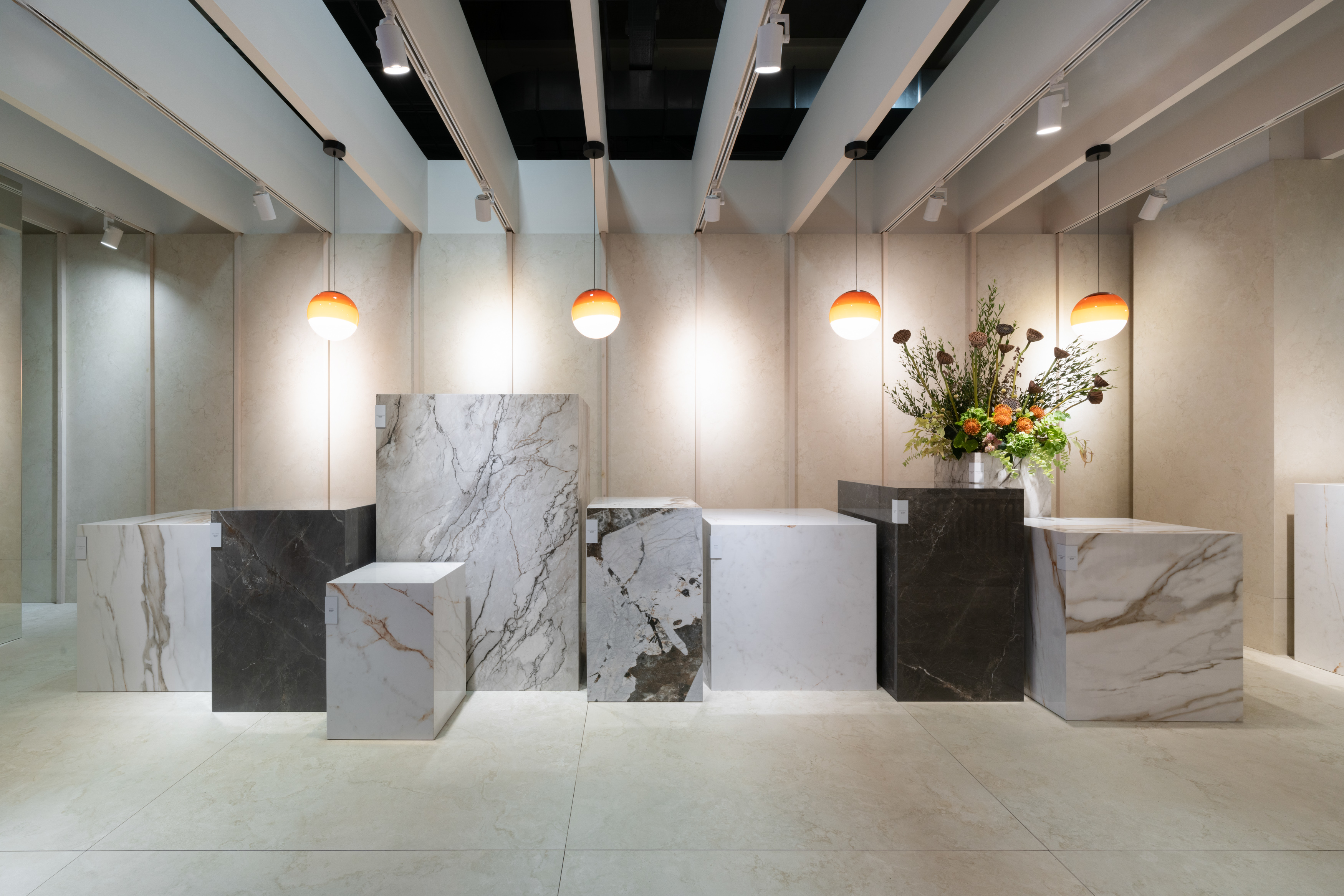
With a dynamic and attractive working area, the material library showed its full working potential and the different sintered stone collections were represented through meticulously arranged cubes and cubes. Each piece, with its distinctive texture and colour, invited visitors to touch and experiment with the materials, making it easy to visualise and select the perfect components for their projects.
At the back of the space, a large mirror served as a photocall.
This strategically placed mirror not only visually expanded the space but also offered visitors the opportunity to capture creative moments, either alone or in the company of colleagues. The photos taken could be shared on social media via the QR code provided for this purpose, adding an element of fun to the visit.
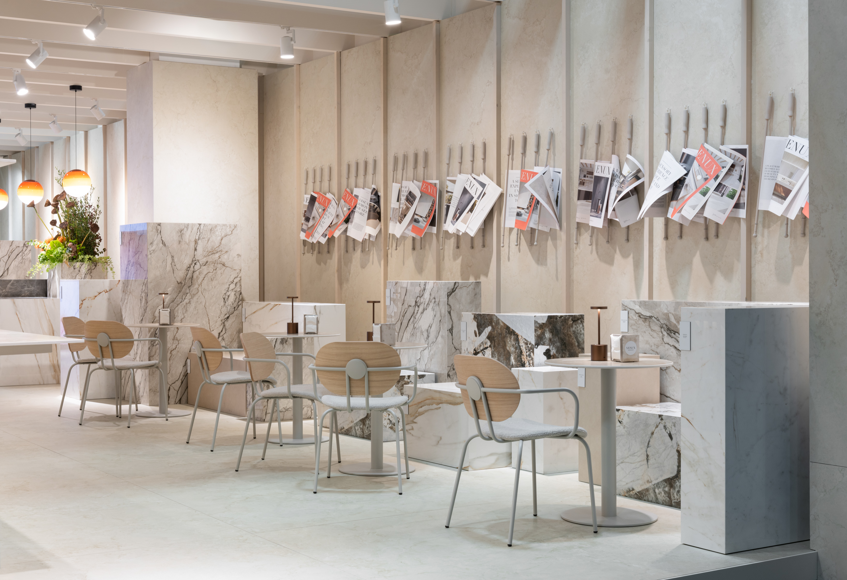
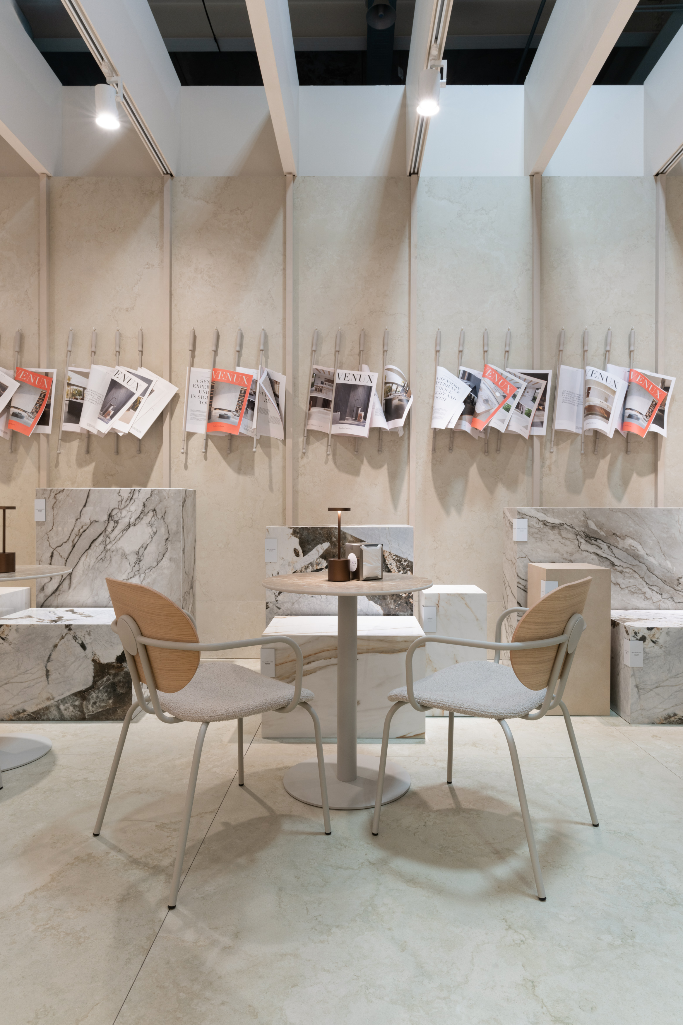
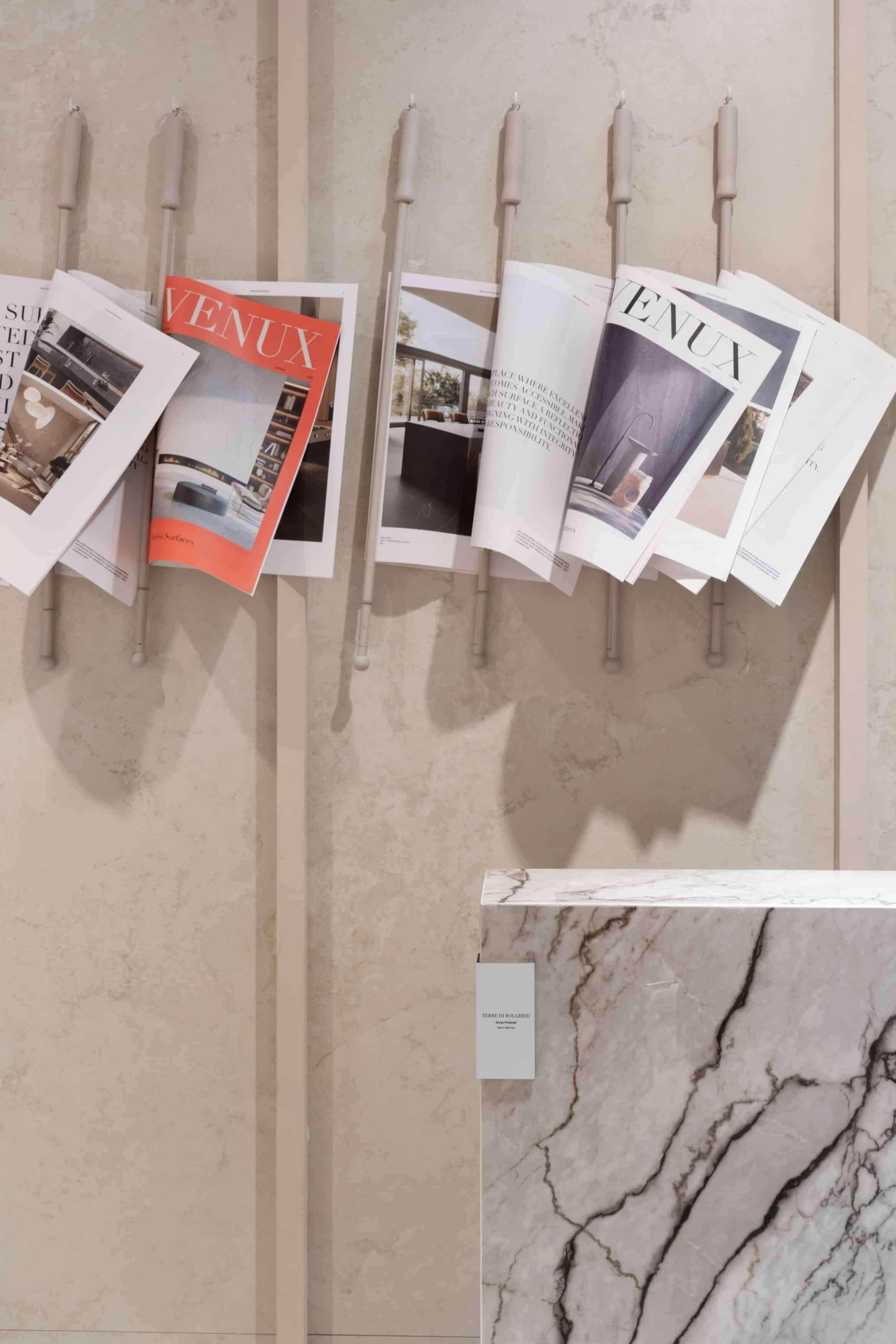
Finally, the visitor arrived at the bar area, designed in the style of traditional Spanish bars, a place where coffee culture and conversation intertwined with the serenity of a working afternoon among friends. This area offered a relaxed and welcoming atmosphere, where visitors could have a coffee, read the VENUX newspaper or enjoy a drink, while exchanging ideas or discussing new projects in a less formal and more friendly environment.
The aim of this space was for visitors to leave the space not only with materials for their next projects, but also with new connections and a unique sense of community.
The project is a testament to how the environment can influence and enrich the creative process, transforming each visit into a memorable and inspiring experience.
Interior design project: Estudi{H}ac
Photographs: Adrián Mora Maroto
