The color palette will change depending on the space.
The choice of color palette is one of the most crucial factors in interior and exterior design. Color not only defines the aesthetics of a space, but also directly influences the perception of volume, light, and overall harmony.
In this context, VENUX surfaces become an ideal starting point for creating balanced palettes, capable of adapting to different uses and styles, bringing visual coherence and architectural character to every project.
Color as a tool for balance in contemporary design.
In current projects, color is used as a strategic resource to reinforce the identity of a space without sacrificing functionality. VENUX’s technical surfaces, with their finishes inspired by natural stone, offer a neutral and sophisticated base that allows for working with a wide range of colors. Soft tones, controlled contrasts, or bolder combinations find in these materials a perfect ally for creating cohesive and timeless environments.
The key lies in understanding the space, its function, and the amount of natural light available. From there, choosing the right palette allows you to enhance the qualities of the material and generate a balanced atmosphere, both in residential settings and in contract projects.

Neutral palettes for bright and serene spaces
In living rooms, dining rooms, and other living areas, neutral palettes continue to be one of the most popular choices. White, beige, sand, or soft gray tones blend perfectly with VENUX surfaces, creating bright and visually spacious areas. This combination is especially effective in open-plan spaces, where the color continuity promotes a clean and organized feel.
The use of textiles in natural tones, light woods, or decorative elements in soft colors reinforces the sense of calm and elegance. VENUX surfaces act as a visual focal point, adding texture and depth without disrupting the overall color harmony.
Warm tones for cozy and balanced environments.
In spaces where a more inviting atmosphere is desired, such as bedrooms, formal dining rooms, or relaxation areas, warm tones serve as the perfect complement. Earthy colors, clays, taupes, and soft browns bring warmth and sophistication when combined with VENUX stone-inspired surfaces.
These palettes allow you to create comfortable environments without sacrificing modernity. Sintered stone, with its natural finish and color stability, balances the intensity of the warm tones and prevents the space from feeling overly heavy. The result is a harmonious, elegant environment designed for well-being.

Sophisticated contrasts for kitchens and functional spaces
Kitchens and work areas are spaces where contrast plays a key role. The combination of VENUX surfaces with dark tones such as anthracite, graphite, or black lends a contemporary and defined character. These well-balanced contrasts reinforce the architecture of the space and create a sense of order and precision.
In these types of environments, color is used to differentiate areas and add visual dynamism. The resistance and durability of VENUX surfaces allow this chromatic balance to be maintained even in high-traffic areas, guaranteeing an impeccable aesthetic over time.

Natural palettes for bathrooms and wellness spaces
In bathrooms and wellness areas, the trend leans towards palettes inspired by nature. Stone tones, sands, and mineral hues blend organically with VENUX surfaces, creating relaxing and balanced spaces. These combinations convey a sense of calm and reinforce the connection with natural materials.
Sintered stone provides visual continuity and a hygienic surface, ideal for environments where functionality is as important as aesthetics. The carefully selected color palette helps transform the bathroom into a space for relaxation and comfort.

Intense colors for projects with personality
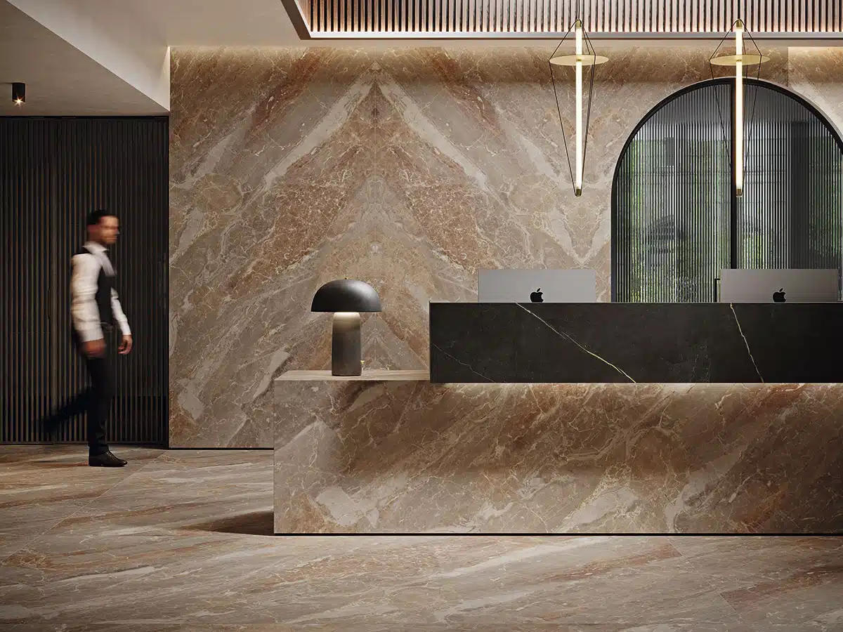
In commercial projects, hotels, restaurants, or corporate spaces, color becomes a key tool for conveying identity. Deep tones find an elegant and balanced support in VENUX surfaces. The material’s understated elegance allows for the incorporation of vibrant colors without sacrificing coherence or sophistication.
These palettes add character and differentiation, creating memorable spaces that reinforce brand image. The material’s color stability and durability ensure that the design remains pristine even in high-traffic environments.
Venux surfaces as a basis for timeless color palettes
Designing a color palette using VENUX surfaces is a commitment to coherence, durability, and elegance. Their aesthetic versatility allows them to adapt to any style and function, becoming the point of equilibrium upon which to build well-defined and harmonious projects.
Whether for interiors or exteriors, residential or commercial spaces, VENUX surfaces facilitate the creation of timeless color palettes, designed to endure and evolve with the space over time.